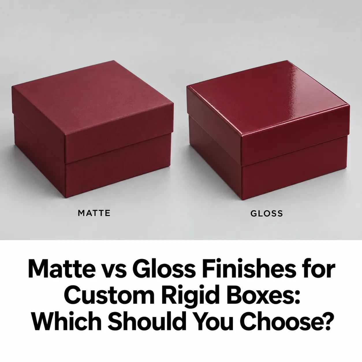
Matte vs gloss rigid boxes can look surprisingly different even when they use the same size, artwork, and printed colors. One finish creates a quieter presentation, while the other introduces shine and stronger reflections. The right choice depends on your product, brand design, handling conditions, and how customers will see the packaging. A finish that looks attractive in a studio photograph may behave differently under bright retail lighting. Before choosing a finish for your custom rigid boxes, compare how both options work with your actual artwork. This guide explains what to consider, what to check in a sample, and how to make a practical decision.
A matte finish creates a surface with reduced shine. Compared with gloss, it reflects light more softly and produces less glare. Matte lamination is one way to achieve this appearance on printed packaging.This makes matte worth considering when your design relies on typography, restrained colors, or a simple logo. The finish allows those elements to remain the main focus without a highly reflective surface competing for attention. However, matte describes appearance rather than one universal material specification. Standard matte lamination, specialty matte films, and matte coatings may feel and perform differently. When requesting a quote, ask which process and material will produce the proposed finish.
Matte vs Gloss Finishes for Custom Rigid Boxes: Which Should You Choose?
A gloss finish creates a shiny, reflective surface. Gloss lamination can make printed colors appear more vivid, making it useful for artwork that relies on bold graphics or colorful imagery. For example, a gift collection with bright illustrated packaging might benefit from the visual energy of gloss. A restrained design may also use gloss successfully if the reflections suit the intended presentation. The important question is how the finish interacts with the complete design. Gloss does not automatically make every box more attractive, just as matte does not automatically make every product look more expensive.
| Consideration | Matte finish | Gloss finish |
|---|---|---|
| Surface appearance | Lower shine and softer reflections | Higher shine and stronger reflections |
| Design direction | Worth testing for restrained, typography-led artwork | Worth testing for bold, colorful artwork |
| Printed color appearance | Review whether the finished colors feel sufficiently rich | Review whether the added visual intensity suits the brand |
| Retail lighting | Check readability across different viewing angles | Check for reflections over important text |
| Photography | Check texture and color under your lighting setup | Check highlights and reflected light |
| Handling | Test marks and scuffs on the specified material | Test fingerprints and surface marks |
| Final approval | Compare a finished sample | Compare a finished sample |
Use this table to narrow your choice, then assess the actual materials proposed for your order.
Start with the design you intend to print. If the packaging uses a small logo, generous blank space, and a limited color palette, compare whether matte supports that restrained appearance. If the design uses large illustrations or colorful patterns, review whether gloss adds the effect you want. Imagine two versions of the same burgundy box. One has a small metallic logo on a matte background. The other has a glossy surface with a large printed pattern. Both could work, but they communicate different visual directions. For two-piece lid rigid boxes, review the lid and base together. The most visible lid panel should look balanced with the side panels when the box is closed.
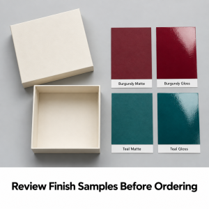
Do not approve the packaging color solely from a screen. Your digital artwork describes the design, but the printed paper and finish determine the physical result. Ask to compare the same artwork with both proposed finishes where samples are available. Use the agreed color references and evaluate the packaging under consistent lighting. Check the main background color, logo, small text, and any product illustrations. If you are extending an existing product range, compare the new box with your current packaging. Decide whether the finish should match the range or deliberately identify a different collection. Record the approved finish alongside the artwork version so future orders have a clear reference.
A display sample may receive little handling. Your production boxes may pass through packing, storage, retail display, and customer use. Lamination can help protect printed surfaces, but its performance depends on the specific film and packaging requirements. A finish should therefore be evaluated for your handling conditions rather than chosen by appearance alone. Ask for a sample of the material being quoted. Handle it normally and inspect it under different light angles. Look for visible fingerprints, rubbing marks, and changes around edges.Avoid assuming that every matte surface resists fingerprints or that every gloss surface resists scratches. If marking is a concern, discuss suitable protective options and confirm their availability.
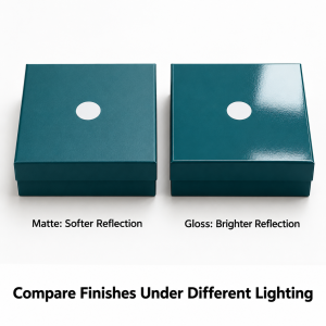
Packaging is often viewed under several lighting conditions. A customer may first see it beneath a bright shop light, then open it at home. Your team may photograph the same box for an online store. Place the sample under lighting similar to its intended display environment. Turn it slowly and check whether the brand name and product information remain easy to read. Pay particular attention to small text positioned on reflective panels. If a highlight covers an important detail, consider changing the layout or reviewing the finish. For magnetic closure rigid boxes, assess both the closed presentation and the open interior. The finish should support the complete opening experience.
Do not use “matte” and “soft-touch” interchangeably when placing an order. A matte finish generally describes reduced shine. Soft-touch refers to a particular tactile effect and should be specified separately. Packaging manufacturers distinguish gloss, matte, and soft-touch lamination as separate finish choices. If you want a velvety feel, explain that requirement and request the relevant sample. If you mainly want reduced reflection, say so. This distinction helps prevent a quotation for standard matte lamination from being mistaken for a quote that includes a specialty tactile finish.
A design can use contrast between a quieter background and a reflective accent. For example, you might discuss a matte surface with selected gloss detailing or metallic foil. However, compatibility depends on the proposed materials and production process. Ask the supplier to review the combination before finalizing your artwork. Confirm which areas receive the additional treatment and how those areas should be identified in the design files. Keep the accent purposeful. A small highlighted logo may provide enough contrast without adding decorative treatments across every panel.
Your exterior finish should work with the inside presentation. Consider the wrapping color, interior printing, insert material, and product arrangement as one design. A highly polished exterior paired with an unfinished interior may not create the experience you intended. When planning rigid boxes with inserts, request a sample that allows you to evaluate both the outer surface and the product display. Place the actual product inside. Review the package closed, open, and viewed from above. This is more useful than judging an empty lid in isolation.
There is no reliable universal rule that one finish will always be cheaper. Ask for matte and gloss options using the same box dimensions, quantity, artwork, construction, and insert requirements. Otherwise, differences in the quote may come from factors unrelated to the finish. At WOW Custom Boxes, the minimum order for custom rigid boxes is 100 boxes. Share your required quantity and ask for the finish options suitable for your design. Also confirm whether specialty treatments affect sampling or production timing. Keep the agreed finish written into the final order specifications.
Before approving your packaging, check:
If you are unsure, contact the packaging team with your artwork and explain where the boxes will be displayed and handled. Ask which samples will help you compare the available options.
No. Matte can suit a restrained design, but gloss can also work well for premium packaging. Choose based on the artwork, product presentation, and approved sample.
Yes. Gloss can create a more vivid printed appearance. Compare the finished sample to confirm that the effect suits your brand colors.
No finish should be assumed to prevent fingerprints completely. Visibility depends on the surface material, color, handling, and lighting. Test the proposed sample.
Yes. Selected gloss or metallic details may be possible, depending on the materials and process. Ask the supplier to confirm compatibility before preparing final artwork.
No. Matte describes a lower-shine appearance, while soft-touch is a separate tactile finish. Specify the effect you want and review the corresponding sample.
Yes. Ask which material samples or finished samples are available. Confirm any sample costs and timing before including them in your approval process.
No. Do not treat either finish as a waterproofing guarantee for the complete box. Confirm the material’s limitations and plan suitable storage and shipping protection.
They can use the same finish for a consistent appearance, but a deliberate combination may also work. Review both parts together before approval.
Yes. Request an updated quote and approve the revised appearance. Keep a new specification record so the change is clear for future reorders.
The minimum order at WOW Custom Boxes is 100 boxes. Provide your quantity, dimensions, artwork, and preferred finish when requesting a quote.